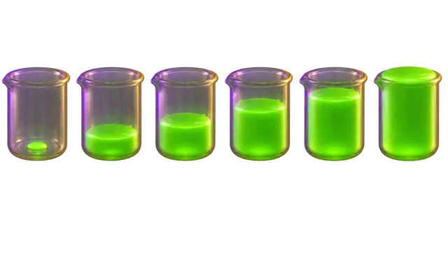
A dose–response relationship is the pattern showing how a living system reacts to different amounts of a substance or stressor over time. It reveals that almost no substance is purely safe or purely toxic on its own. The exact quantity determines whether an exposure cures, has no effect, or causes harm.
By the edgi team We find the most surprising true thing about an idea and build a 60-second lesson around it.
In the 16th century, the physician Paracelsus famously declared that the dose makes the poison. He shattered the ancient belief that certain substances were inherently 'good' or 'bad.'
He realized that medicine and toxins are often the same thing, separated only by the amount you consume.
The biological curve
Biological reactions rarely follow a straight line. They typically follow a Sigmoid Function. This curve shows a slow start, a rapid surge of effect, and eventually a plateau where adding more dose provides no extra benefit.
This is the fundamental math of Toxicology.
The hormesis twist
Sometimes, the curve behaves unexpectedly. This is called Hormesis. It describes a phenomenon where a tiny, sub-lethal dose of a stressor, like radiation or a toxin, actually triggers a protective, healthy response in the body.
It is the reason why some poisonous plants are medicinal in microscopic amounts.
The safety zone
Pharmacologists use these curves to calculate the Therapeutic Window. It is the narrow, critical range where a drug is potent enough to treat your condition, but not toxic enough to kill you.
Every prescription you take is a calculated bet that you will stay inside this window.
How dose–response curves work
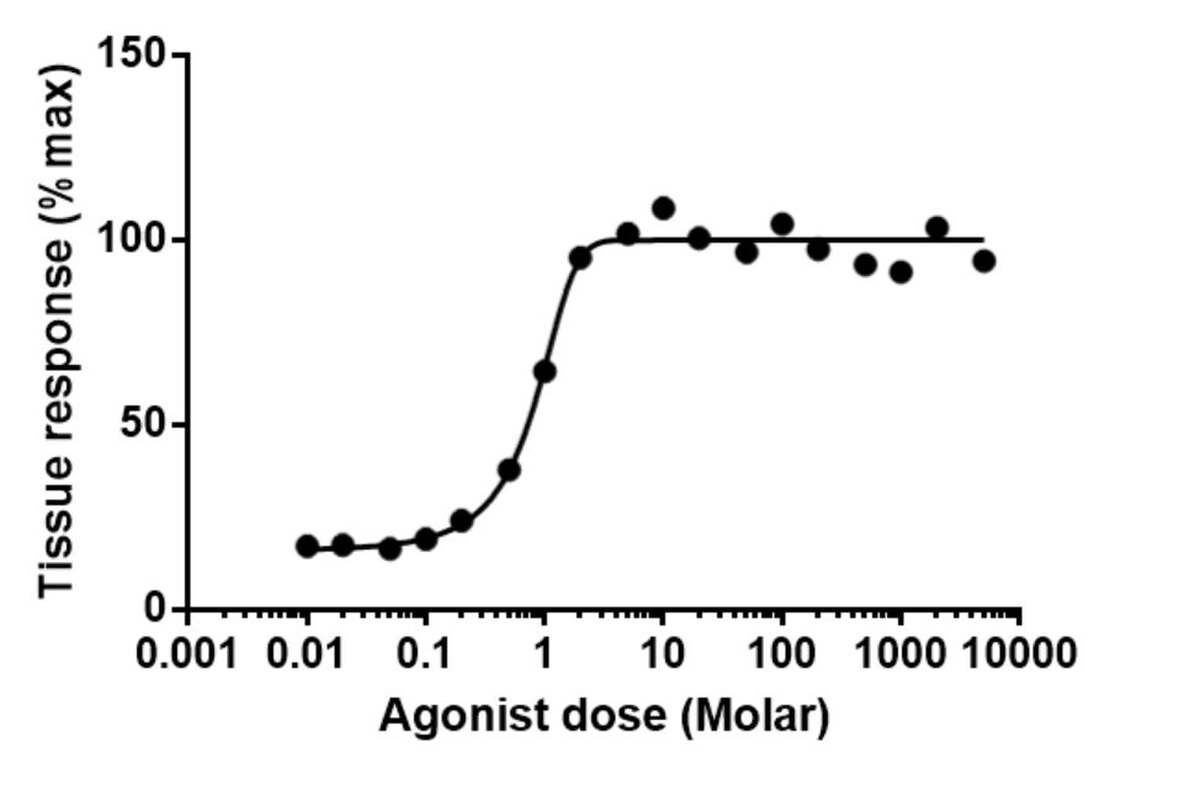
Biological responses rarely change in a straight line as an exposure increases. Instead, plotting dose on the horizontal axis and the biological response on the vertical axis typically produces an S-shaped or sigmoidal curve. The response begins slowly, climbs steeply through the middle range of exposure, and eventually levels off at a maximal effect.
This curve maps how normalized tissue response climbs from zero to maximal intensity along a sigmoidal path as the agonist concentration increases. Jamgoodman, CC BY-SA 4.0, via Wikimedia Commons
Pharmacologists frequently fit logarithmic data to the Hill equation to analyze these patterns. This mathematical model evaluates key metrics like the EC50, which is the exact concentration of a substance that produces half of its maximum possible effect. Together with parameters like maximal response and the Hill coefficient, these values quantify the potency and biological activity of a drug.
How scientists measure and apply exposure data
Researchers gather dose–response data through laboratory setups like organ bath preparations, ligand binding assays, functional tests, and human clinical trials. Measurable effects can be continuous, such as the force of a muscle contraction, or discrete, such as the survival count in a test group. Specific stimuli target distinct cellular sites, like nicotine acting on the nicotinic acetylcholine receptor.
Regulatory agencies like the U.S. Food and Drug Administration and the U.S. Environmental Protection Agency rely on these models to establish safety guidelines, evaluate pollutants, and approve new medicines. By tracking where effects surge and where they reach hazardous levels, scientists determine the exact therapeutic window required to treat patients safely.
Play the lesson in edgi and the card is yours. It lands on your Map next to the ideas it connects to, and turns from matte to foil to gold as you learn more around it.
What is the difference between individual and population dose–response curves?
Individual curves track the intensity of a biological reaction in a single organism or tissue sample as exposure climbs. Population curves track the proportion of a whole group that displays a specific outcome, such as symptom relief or death, at varying exposure levels.
What is the linear no-threshold model?
The linear no-threshold model assumes that any exposure level carries a proportional risk, with no safe baseline value. It is commonly studied in the context of radiation exposure.